Amazon ecommerce store for DockATot - multi-functional products for babies and toddlers
THE MISSION
Build an ecommerce store on Amazon that closely follows DockATot’s existing brand guidelines and core values. With an already established brand outside of Amazon, DockATot wanted their store to be visually cohesive with their existing branding and to serve as an extension to their website while being optimized for sales on Amazon.
THE OUTCOME
The store design highlighted DockATot’s small range of products with an emphasis on product benefits, safety features, and simple navigation while staying true to the brand’s visual identity and design ethos that your home should be a reflection of your style.
AGENCY
Amazowl
DATE
2022
Banner graphics for the ecommerce store
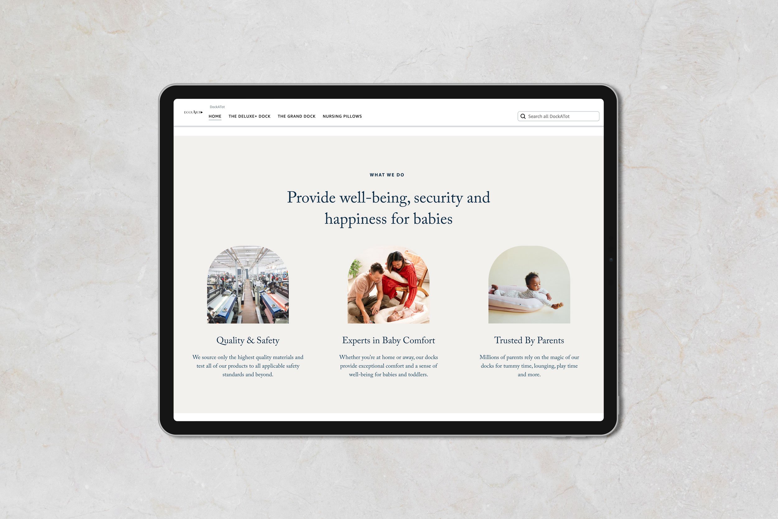
Various banners were designed to highlight key product features, help the shopper navigate the store, and share brand attributes. The use of geometric framing devices for lifestyle imagery was inspired from the DockATot website and was used as a visually dynamic way of combining text with imagery.
DockATot homepage design
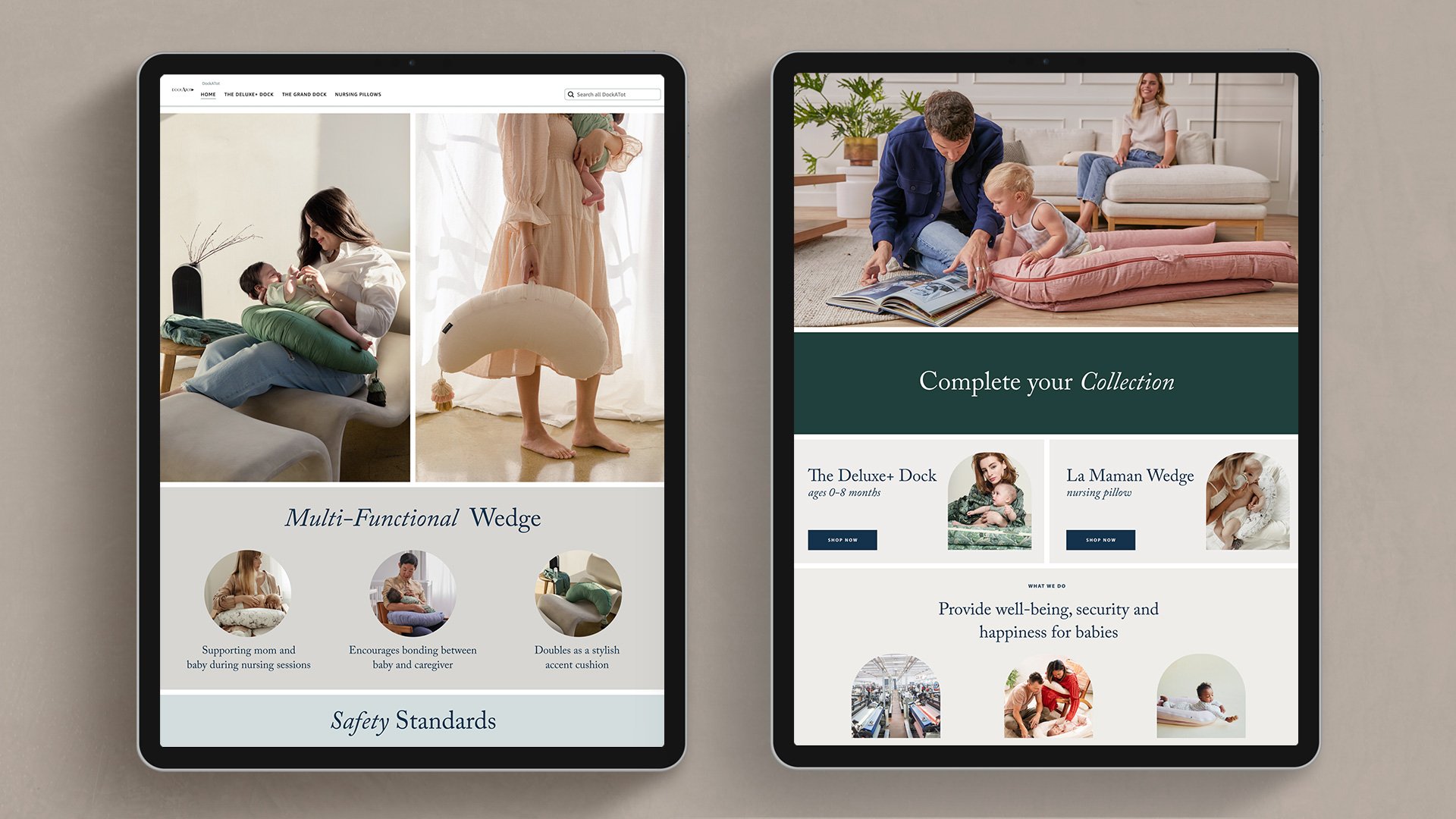
The homepage of the store was designed to clearly layout the different products and explain their differences in a succinct way. Icons were overlaid onto lifestyle imagery to quickly communicate key product features while showing the products in context. The page was made to be simple so that the shopper could easily find what they were looking for, leaving more detailed product info on the product specific store pages.
Contextualizing DockATot’s products
Large product photos were used to show the key use cases of the products while helping the customer to visualize DockATot’s product offerings in the shopper’s home.
Call-to-action buttons
Call to action buttons were added towards the bottom of every page so that the shopper always had a new destination to move to.


